UI overlays and cursors
A screenshot or screen recording looks like a product when it sits in a browser window or on a phone. And a pointer that moves and clicks shows how the product is used. These two make app demos and website showcases quick to build.

Put a frame round a card
- Add a rectangle and put your screenshot or video on it. See Images and video.
- With it selected, go to the Panel section and click Choose… beside UI overlays. You can also use Menu › UI overlays….
- Pick an overlay in the gallery.
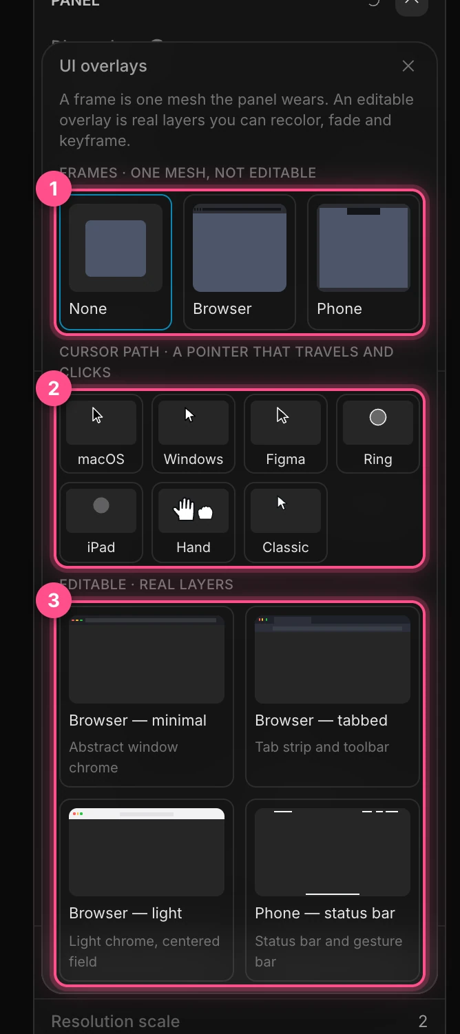
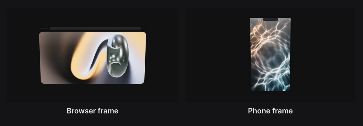
- Frames (None, Browser, Phone) are a single dark shape the card wears in front of its edges. Quick, but you can't change their parts.
- Cursor path adds a pointer in one of seven styles. See Cursors.
- Editable overlays are built from real layers you can recolor, fade and animate: Browser — minimal, Browser — tabbed, Browser — light and Phone — status bar.
An editable overlay wraps the card in a group named after it, such as "Browser — minimal mock", holding the card and the overlay's parts ("Toolbar", "Address bar", "Time" and so on). Move or animate the group to move it all.
To swap a frame for its editable version, click Make this frame editable in the gallery, or right-click the card and choose Make frame editable. Clear in the Panel section takes a frame off.
Note
An editable overlay is sized to the card when you add it. If you resize the card afterwards, add the overlay again. And if the card had animation on its position, rotation or scale, move those keyframes to the new group.
Cursors
A cursor travels from stop to stop along a smooth path, and can click, tap or press and drag at each one.

To add one: open the UI overlays gallery and pick a cursor style, or click + in the Layers panel and choose Cursor path. It's named "Cursor 1" and sits just in front of the scene.
To give it a path:
- Move the cursor to where it should start.
- Right-click it and choose Add stop here, or Add stop here + click for a click.
- Move it to the next place and add the next stop, and so on.
You don't time the stops yourself: the cursor travels between them at its Speed, and waits at each for its hold.
With the cursor selected, its stops show on the canvas as numbered handles; drag one to move its stop.
The Cursor path panel
Right-click the cursor and choose Cursor path… for its panel.
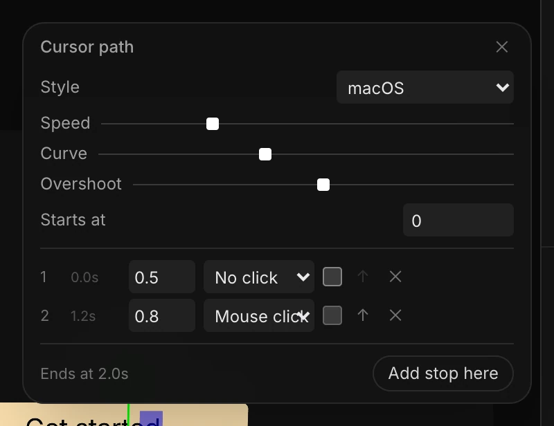
| Setting | What it does |
|---|---|
| Style | How the pointer looks. See below. |
| Speed | How fast it travels between stops, in scene units a second |
| Curve | From straight lines (0) to sweeping arcs (1) |
| Overshoot | From gliding to a halt (0) to overshooting and correcting, like a real hand (1) |
| Starts at | When the first move begins, in seconds |
Each stop has a row: its number, when the cursor arrives, how long it holds there, and a click: No click, Mouse click, Soft tap or Pop. The box after it is Press: the cursor presses at this stop and holds down to the next one, dragging the layer you choose. The arrow moves a stop earlier; × removes it.
Add stop here adds a stop at the cursor's position. The panel shows when the path ends, in amber if it runs past the end of your piece.
A click dips the pointer slightly, spreads a soft pulse, and adds a click sound to the timeline.
Note
Changing a stop rebuilds the cursor's keyframes, replacing any you edited by hand.
Cursor styles

| Style | Looks like |
|---|---|
| macOS | The black arrow with a white edge |
| Windows | The white arrow with a black edge |
| Figma | The rounded, filled arrow |
| Ring | A see-through disc, as screen recorders draw the pointer; a click pulses the ring |
| iPad | A small see-through disc; a click shrinks it a little |
| Hand | An open hand that closes while it drags |
| Classic | The older lit arrow, kept for older projects |
A cursor is a shape, so its color is in Panel Fill, its edge in Stroke, and its Opacity in Panel Surface. Choosing a style resets those.
Tip
Set the cursor's Position Z close to the card it points at. A cursor floating far in front drifts off its target when the camera moves.