
Shapes and frames
Shapes are the building blocks of most scenes: a card, a button, a badge, a ball, a ring. Paraplex calls its basic shape a panel, which is why its sections are named Panel Fill, Panel Surface and so on.
Draw a shape
- In the dock, click Rectangle. The button lights up: the tool is ready.
- Drag on the canvas to draw the shape at the size you want. Or just click, and you get the default size where you clicked.
| While you drag | What happens |
|---|---|
| Hold Shift | A square, or a circle |
| Hold ⌥ Option (Alt) | The shape grows from the point you started at, its center |
The tool puts itself away after each shape, so the next click selects as usual. To put it away without drawing, press Esc or click the button again.
The other shapes
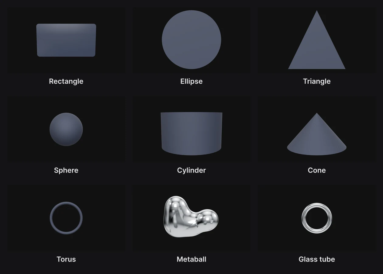
Press and hold Rectangle to open its family: Ellipse, Triangle, Sphere, Cylinder, Cone, Torus, Metaball, Glass tube and Frame. A right-click, or a click on the button's small corner arrow, opens it too. Choose one, then draw it like a rectangle.
| Shape | Good for |
|---|---|
| Rectangle | Cards, buttons, screens, panels of text |
| Ellipse, Triangle | Dots, badges, play buttons, arrows |
| Sphere, Cylinder, Cone, Torus | Solid 3D objects. A picture wraps round them. |
| Metaball | A blob of liquid metal. See Blobs and glass tubes. |
| Glass tube | A glass ring. It's added in the middle of the frame straight away, not drawn. |
| Frame | A group with a background, ready for a layout. See Frames below. |
Each new shape is named after its kind and a number, like "Panel 1" or "Sphere 4". Rename it in the Layers panel.
Size
The Panel section sets a rectangle's proportions.
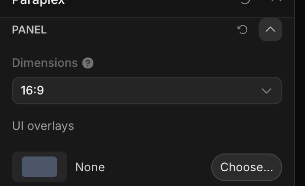
- Dimensions picks a shape: 16:9, iPhone 15, Square, 3:4 Portrait or Business card.
- Custom shows Size, with a width and a height. They read in pixels; click the unit beside a number to switch to scene units (u), a share of the frame's width or height (vw, vh) or a percentage.
A rectangle you drew by dragging is already Custom, at the size you drew. To make anything bigger or smaller without changing its proportions, use Scale in the Transform section.
UI overlays put a browser window or a phone round the card. See UI overlays and cursors.
Depth, corners and edges
The Panel Surface section shapes the slab itself. Every setting with a diamond can be animated.
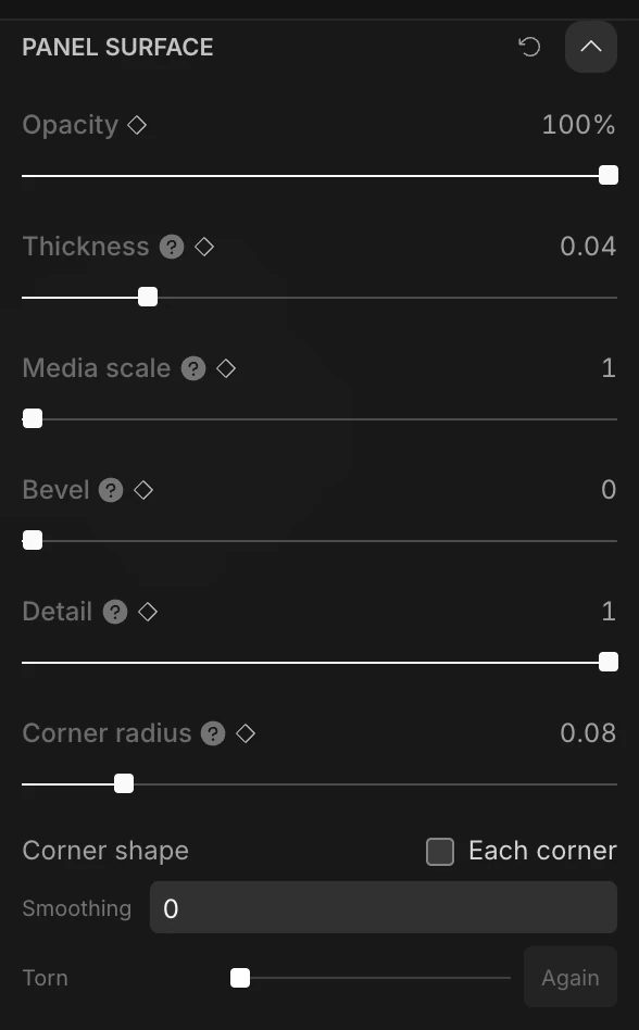
| Setting | What it does |
|---|---|
| Opacity | How see-through the shape is, from 0 to 100%. |
| Thickness | How deep the slab is, as a share of its shorter side. 0 makes it perfectly flat. |
| Media scale | Zooms into a picture on the shape. See Images and video. |
| Bevel | Rounds the edges where the face meets the sides. The shape keeps its size. It needs some Thickness to show. |
| Detail | How smooth curves are. Lower it for a faceted, low-poly look: a circle turns into a few flat sides. |
| Corner radius | Rounds a rectangle's corners. At 0.5 the short ends turn fully round, like a pill. |
| Each corner | Gives each corner its own radius: top left, top right, bottom left and bottom right. |
| Smoothing | Blends the rounded corners into the sides, like an app icon. 0.6 matches iOS. |
| Torn | Rips the edges like torn paper: about 0.2 is mostly clean, 0.9 is rough. Again tears it a different way. |

Note
Not every setting applies to every shape. Corner radius, Each corner, Smoothing and Torn are for rectangles. On a torus, Thickness sets how thick the ring's tube is; spheres, cylinders and cones ignore it.
Color, outline and material
- Panel Fill gives the shape a solid color, a gradient, or a live shader. See Fills and gradients and Shader fills.
- Stroke adds an outline. See Strokes.
- Panel Material sets what it's made of: Matte, Glossy, Glass, Frosted glass, Metal, Fabric, or None (unlit) for flat color that ignores the lights. See Materials and appearances.
New rectangles are Glossy and the others Matte, all in a dark slate gray.
Frames
A frame is a group with a background card, ready to hold a layout. Choose Frame in the Rectangle family, then drag a box on the canvas, or click for one the size of the frame.
The frame arrives selected, with its background (a layer named "Frame") inside. In its Layout section, choose Grid or Flex first, then add layers to it: the frame arranges them, and the background always matches the layout's box. See Layouts and bentos.
Important
Choose the layout before you add layers. Until it has one, a frame spreads what's inside it into a row, background included.