
Charts and data
Paste a few rows of data and Paraplex builds an animated chart from ordinary layers: bars that grow, a line that draws itself, slices that sweep open. Because every bar and label is a real layer, you can restyle, move and animate any of it.
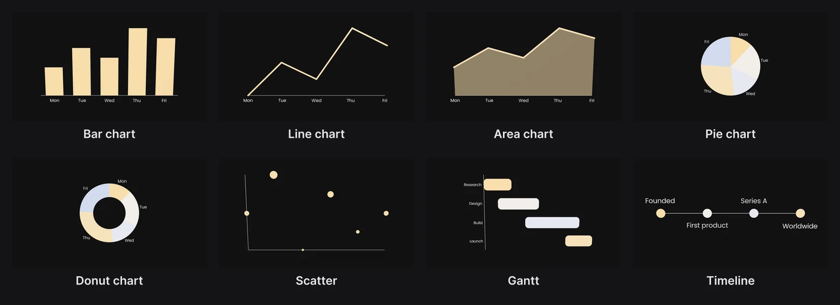
Make a chart
- In the dock, click Chart. Press and hold it to start from a particular kind.
- In A chart from data, paste your data into Sheet (CSV), click Upload CSV…, or click Sample to try one.
- Pick the Kind and the columns, then click Add chart.
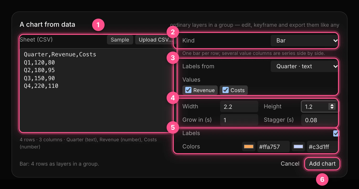
- The sheet: comma-separated rows, with the column names in the first row. The line under it shows what Paraplex read: how many rows and columns, and whether each column is numbers, dates or text.
- Kind: the chart type, with a line saying how it reads your data.
- The columns: which column names each item (Labels from), and which hold the numbers (Values; for a scatter X, Y and Size; for a Gantt Start and End; for a timeline Time).
- Width, Height: the chart's size in scene units. Grow in is how long each item takes to animate in; Stagger is the gap between items.
- Labels on or off, and the Colors: one per series, or one per slice.
- Add chart.
Important
Paste comma-separated data. Data copied straight from Excel or Google Sheets is separated by tabs, and arrives as one column. Save the sheet as CSV and upload it, or paste it into a text editor and swap the tabs for commas first.
Numbers can carry currency signs, percent signs and thousands commas: $1,200 and 45% both read as numbers. A chart can have up to 400 rows.
The kinds
| Kind | Best for | Animates by |
|---|---|---|
| Bar chart | Comparing amounts; several value columns stand side by side | Bars growing up |
| Line chart | Change over time | The line drawing on |
| Area chart | Change over time, with weight | The area rising |
| Pie chart, Donut chart | Parts of a whole | Slices sweeping open |
| Scatter | Two measures against each other, dot size as a third | Dots popping in |
| Gantt | Tasks over time | Bars growing along their spans |
| Timeline | Events in order | Dots and labels appearing in turn |
Edit a chart

A chart is a group of layers named "Bar chart 1" and so on. Its bars, labels and axis are ordinary shapes and text: recolor them, give them depth, or change their keyframes like any other.
To change the data, right-click the chart's group and choose Edit data & regenerate…. Regenerating rebuilds the bars and labels from the new data, so changes made to them are lost; the group's position and name stay.
Note
The growing animation always starts at the beginning of the timeline, whatever the chart's clip says. To start it later, drag its keyframes later (see Editing keyframes), or ask the assistant to start the chart at the time you want.
Unit charts
A unit chart shows a number as countable things: 35 people, a stack of coins, a row of pills. Any particle cloud can become one, in its Unit chart section.
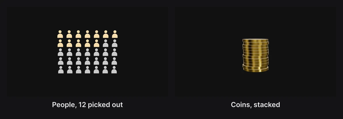
- Add a particle cloud. See Particles.
- In Unit chart, choose an arrangement: Row, Column, Grid or Stack.
- Choose the things: Paper, Coins, Pills, People, Dots or Blocks.
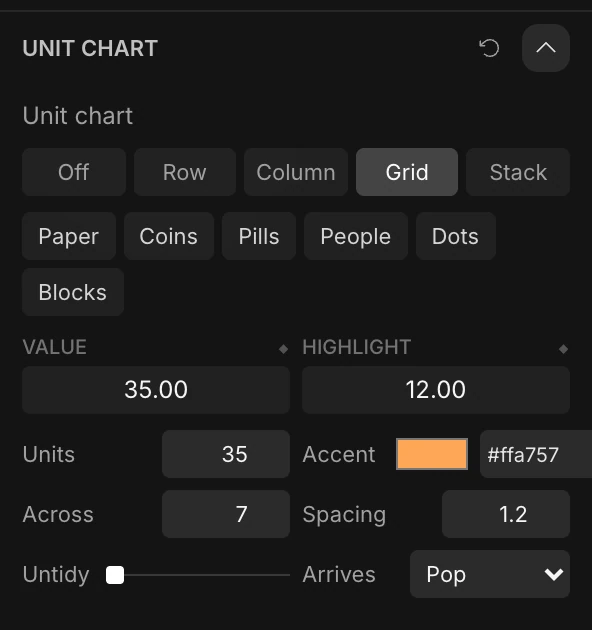
| Setting | What it does |
|---|---|
| Value | How many show. Animate it and the units arrive one by one. |
| Highlight | How many of them, from the start, wear the Accent color |
| Units | The total, shown or not |
| Across | Units per row, in a grid |
| Spacing, Untidy | The gap between units, and how loosely they sit |
| Arrives | How each unit enters: Grow, Pop, Drop or Fade |
Important
Choosing an arrangement replaces the cloud's count, color, size and shape with the preset's, and drops its data and formulas. Choosing Off doesn't bring them back.
A number counter can count along with a unit chart: in its text's Animate › Effects › Number, choose the chart under Follows. See Text animation.
Particles from data
Every row of a sheet can be one particle, placed by its numbers: a scatter of thousands of points, a 3D cloud of survey answers, a map of cities.
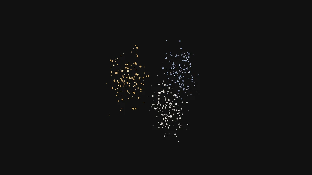
- Press and hold Chart and choose Particles from data, or, on an existing cloud, click Particle Field › Data › Bind data….
- Paste or upload the sheet, and pick the columns for X, Y and Z, and optionally Size and Color.
A text column used for color gives each group its own color from the cloud's colors. A cloud holds up to 10,000 rows. Unbind takes the data off again.